Your website design is an important part of telling your brand story and significantly impacts your brand's perceived credibility.
In fact, 75% of your website's credibility comes from its design. Establishing your brand’s authority is crucial to converting new customers and earning the loyalty of existing ones. Whether you're embarking on a full website redesign, or you're looking to improve your current website, these eight trends will help you build trust, attract new customers, and grow your brand.
Website Design Trends
- Double Down on Responsive Design
- Prioritize Experience Over Aesthetic
- Invest in Customization
- Prioritize Features that Convert
- Focus On Accessibility
- Establish a Clear Hierarchy and Structure
- Make Your Website Faster
- Communicate Your Brands Purpose
Double Down on Responsive Design
Industry leaders have been talking about responsive website design for so long that we assume every site is incorporating these best practices. Surprisingly, many don’t, or they think of it as an afterthought!
58% of global website traffic comes from mobile devices (that doesn't include tablets).
Often designers will start with the desktop designs and never get around to mobile and tablet. This is a mistake. With so much of your audience reaching your site on mobile screens, your mobile experience needs to be just as good, if not better than desktop.
If you neglect your mobile experience - you will risk losing customers.
That’s why we recommend having a mobile-first mindset! Start with your mobile designs. Build the best experience for small screens and then work your way up to tablet, laptop, desktop, and even TV screens. Find logical breakpoints and don’t be afraid to leverage completely different modules to convey your message to be optimized for the right screens.

Prioritize Experience Over Aesthetics
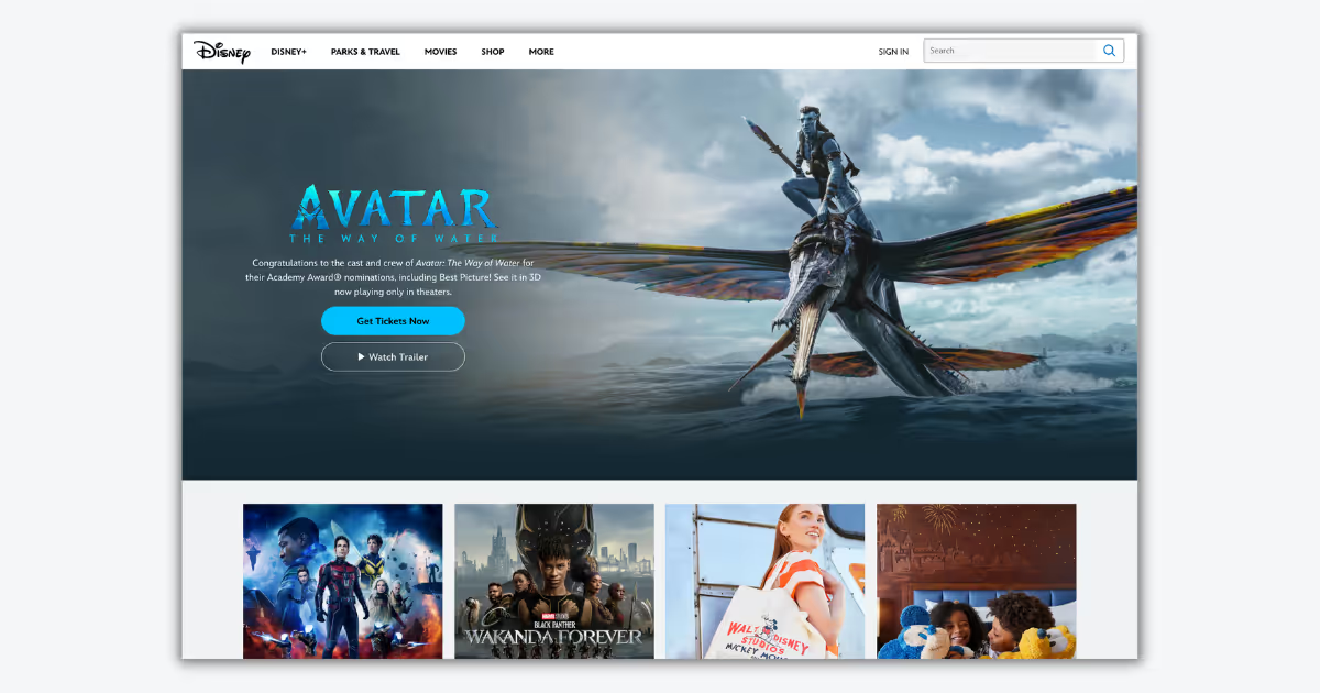
If a website element is visually stunning, but difficult to use, should it be on your website? Probably not. We are seeing an increase in websites trying to stand out with over-the-top visually pleasing design elements. The problem is they are hard to use, distracting, and often feel out of place. Digital leaders know this - many of the top brands have traded overly complex features for sleek, sophisticated designs (i.e. Apple and Disney).
At Fratzke, we have a clear rule when deciding if a design element should be included on a site: keep it simple. Simplicity is the greatest form of sophistication for a reason. It just works!
Think twice before incorporating unnecessary design elements and excessive animations that dilute your brands overall message and purpose. Find the balance between functionality and aesthetics and lean towards simple, useful elements that are timeless, easy-to-navigate and tell your story.

Invest in Custom Design
It’s hard to stand out in today's crowded marketplace. One of the best ways to make sure that your website stands out is to invest in custom website design and development. Starting from the ground up also ensures your site is unique. Nothing is worse than landing on a cookie cutter site. If your site looks generic - how are you going to stand out from the competition?
Your site should be an extension of your brand. You only have a few seconds to make a first impression on new users. Make it count. Make it eye-catching. Don’t fall victim to relying on the same old design trends.
A custom design allows your site to stand out and build your brand. Brand trust goes a long way - 90% of shoppers will pay more for a product from trusted brands (Salsify). Your website is one of the best ways to build this trust with customers.
Prioritize Features that Convert
Sometimes marketing teams and designers go crazy on adding new features to their sites. This year will be about cutting out the noise and removing features that don’t convert. Marketers can leverage Conversion Rate Optimization (CRO) strategies to evaluate what features are converting and which ones need to go in order to improve effectiveness.
An example of a feature that doesn’t convert as well as it used to is the website slider or carousel. Research shows that users are increasingly interacting less with carousels. Don’t get caught hiding valuable content or offers on slide two or beyond. Consider displaying this information in its own module where it’s more likely to be seen and acted upon.

Focus On Accessibility
Accessibility continues to grow as a key focus for website design in 2023. Creating an inclusive website experience is not just the responsible thing to do - it’s also the law. The good news is that accessibility best practices usually follow general design best practices, so taking action on making your website accessible for all users is a win-win. Unfortunately, accessibility is often not planned for or prioritized.
Here are some of the most common accessibility mistakes on website’s today:
- Insufficient color contrast
- Missing or inappropriate alternative text for images or graphics
- Inadequate or missing visual focus indicators
- Overlooking accessible names or labels
Related Reading: 4 Website Accessibility Mistake and How to Solve Them
If your brand hasn’t put much thought toward your site’s accessibility, now is the time to take action. The next best step is to run a site accessibility audit - from there you can develop a roadmap for improving accessibility.
Establish a Clear Hierarchy and Structure
The main purpose of establishing a clear hierarchy and structure for your site is to ensure that your customers can achieve their goals easily and efficiently. Sites with clear and easy-to-follow organization are more likely to convert users into customers.
Additionally, all of the best practices below also benefit your site’s SEO.
Site Structure Best Practices
- URL Structure - Your site's URL structure should be as simple as possible. Consider organizing your content so that URLs are constructed logically and in a way that is easy for humans to understand.
- Clean Site Navigation - Clear header and footer navigation menus with relevant links help users find what they are looking for faster. Users should be able to find what they are looking for in three clicks or less.
- Typography - Establishing and implement a consistent typography style guide across your site. Using headings and subheadings to indicate significance can help users better understand where to focus their attention. Use text weights, colors, and sizes to lead users to the most important information.
- Breadcrumbs - Introduce a secondary form of navigation on your site and improve findability with breadcrumbs. They also help reveal the user's location on your site and make it easier for visitors to find related content.
- Inverted Pyramid Method - Another strategy is to build your site using the inverted pyramid method often used by journalists. Start with the most important information at the top of the page, and then add additional details as you progress down the page in decreasing order of importance.
Make Your Website Faster
How fast do your webpages load? Are they slower than the benchmark? Does it matter? You bet it does! 70% of consumers say that page speed impacts their willingness to buy from an online retailer.

When it comes to load time, seconds count. According to research, website conversion rates drop by an average of 4.42% with each additional second of load time. We’re talking about leaving hundreds of thousands of dollars on the table. The faster your website loads, the better.
Marketers can no longer ignore poor site speed performance, especially on mobile devices. Every year Google continues to emphasize page speed as a critical ranking factor to help “make the web faster”. This is the year to take action. Look for site wide optimizations like compressing file sizes, reducing unused JavaScript, and implementing lazy loading.
Audit your top performing pages to find ways to shave off every millisecond possible. When you optimize your load times, you can expect to see improvements in user experience (UX), conversion rates, and sales revenue.
Communicate Your Brand’s Purpose
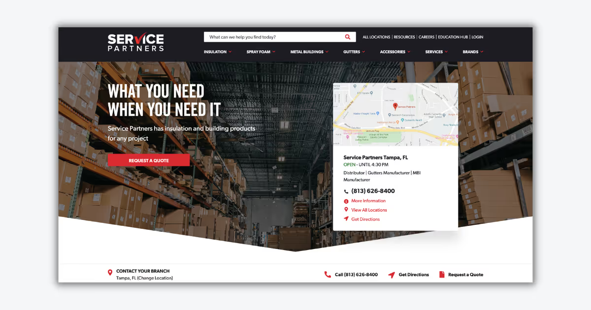
When it comes to the power of purpose, the data is clear: companies that lead with purpose grow three times faster than competitors, while achieving higher revenue and customer satisfaction. If your company doesn’t have a clear purpose, now is the time to start defining it. If your brand does have a purpose, make sure it’s clearly communicated on your website.
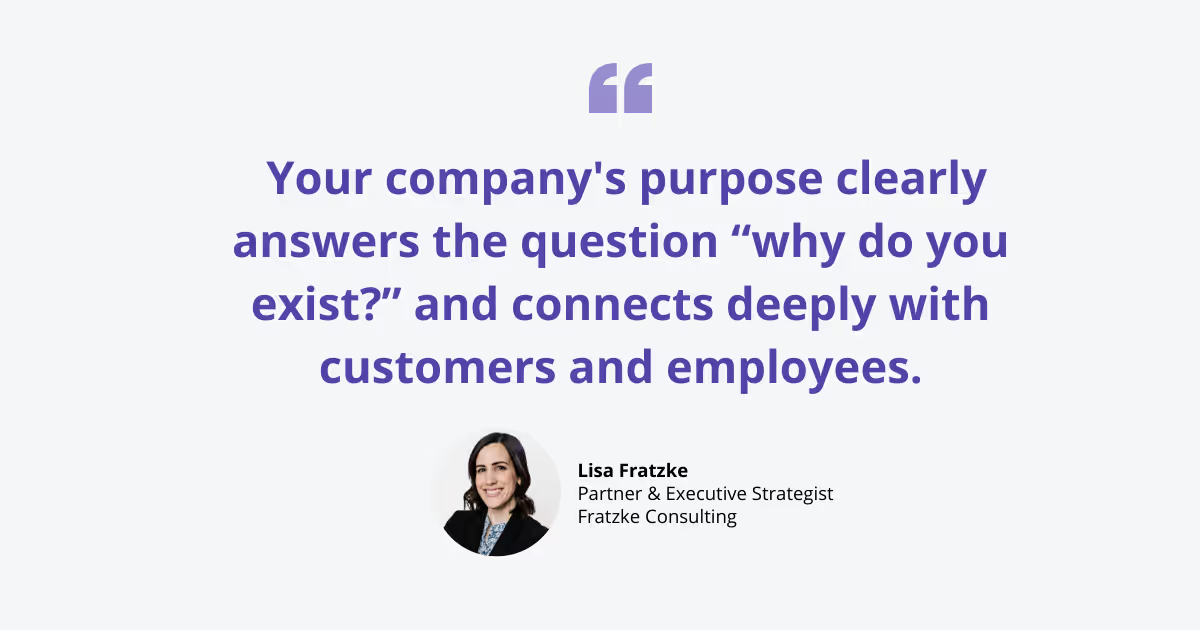
According to Lisa Fratzke, Partners & Executive Strategist, “Your company's purpose clearly answers the question “why do you exist?” and connects deeply with customers and employees.”

Clearly communicating your brand’s purpose throughout your website helps build trust, credibility, and authority. It affirms your visitors that they are in the right place and creates an authentic connection that will help build loyalty over time. If your website doesn’t clearly communicate your brand's purpose, it may be time for a redesign.


